Livlab relied heavily on newsletters to connect with its community, but existing templates felt outdated and off-brand.
Layouts were inconsistent and overly promotional, lacking a clear hierarchy and personal tone.
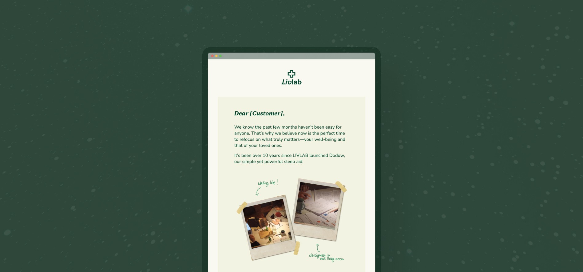
The project aimed to strengthen the brand’s visual identity and create reusable, editorial-style templates that felt closer to a letter than a campaign.
Type
Visual Identity
Year
2024
Process
Content and Structure
Reviewed previous campaigns with marketing and founders to understand tone, goals, and recurring pain points.
Identified the need for a clearer narrative flow, blending editorial storytelling with product focus.
Design and System
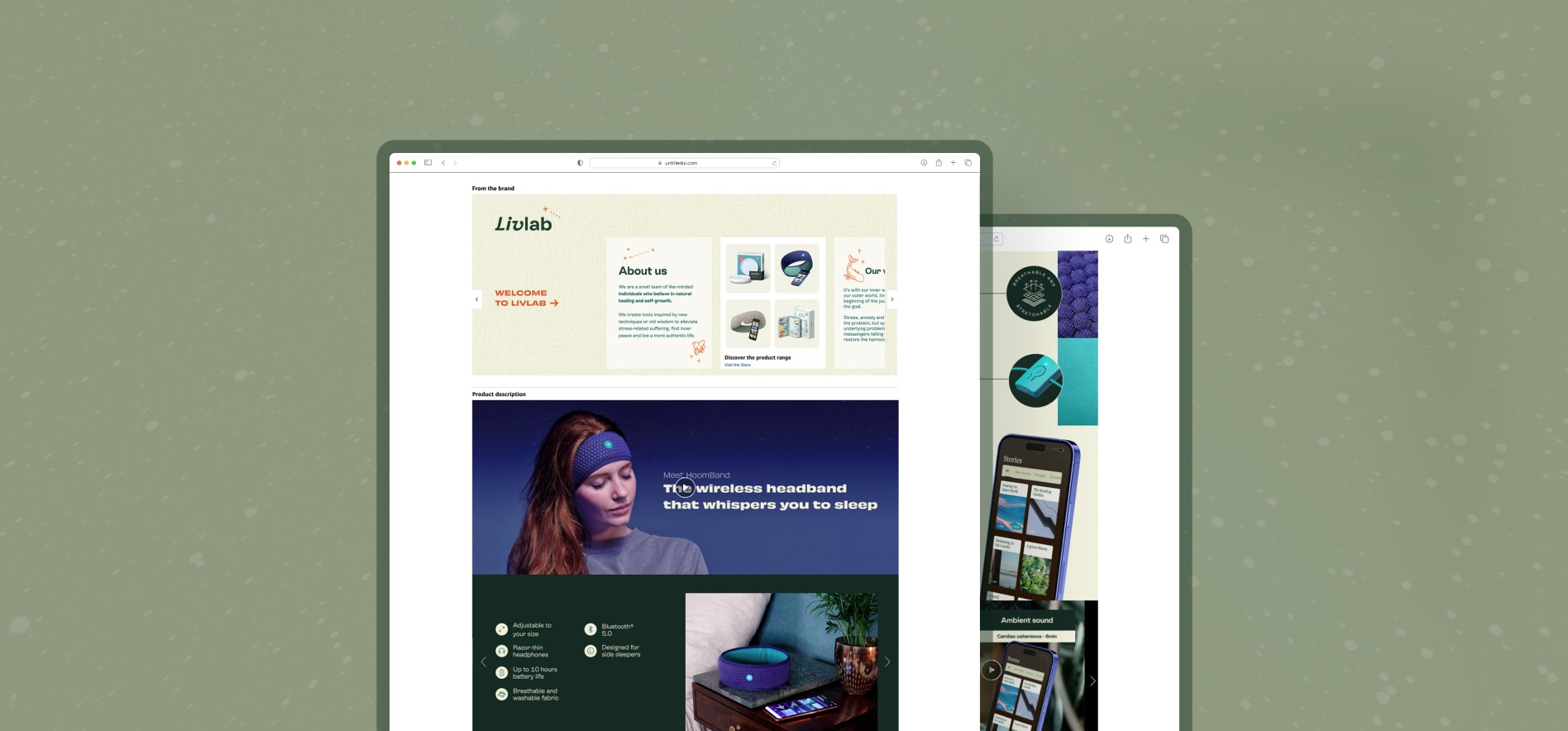
Redesigned templates using modular content blocks for flexibility and scalability.
Defined hierarchy and rhythm for better readability, applied brand typography and color, and ensured strong mobile responsiveness.
Implementation
Built the new system directly within Klaviyo, adapting layouts to its editor constraints.
Focused on accessibility and easy updates, allowing the team to launch future campaigns quickly without design support.


Outcome
Delivered a reusable newsletter template system that reduced production time and supported more consistent communication.
The new templates unified Livlab’s visual language and introduced a more editorial, personal tone across email communications.
Learnings
This project reinforced how UX principles like hierarchy, clarity, and narrative flow can elevate communication design.
I learned to design within platform limitations while maintaining brand coherence and storytelling.