Livlab had a growing range of sleep-related products, but customers recognized each item — like Dodow or HoomBand — more than the brand itself.
On Amazon, listings lacked cohesion and storytelling, creating a gap between the products and Livlab’s identity.
The goal was to improve clarity and conversion on Amazon by creating a consistent structure, clearer hierarchy, and stronger brand storytelling within platform constraints.
Type
Web & E-commerce UX/UI
Year
2024

Process
Strategic Foundations
Alongside the Project Manager, I reviewed Livlab’s website and existing Amazon listings to identify gaps in hierarchy, messaging, and visual consistency across products.
We defined a unified structure and visual approach that could balance brand storytelling with e-commerce clarity.
Design Execution
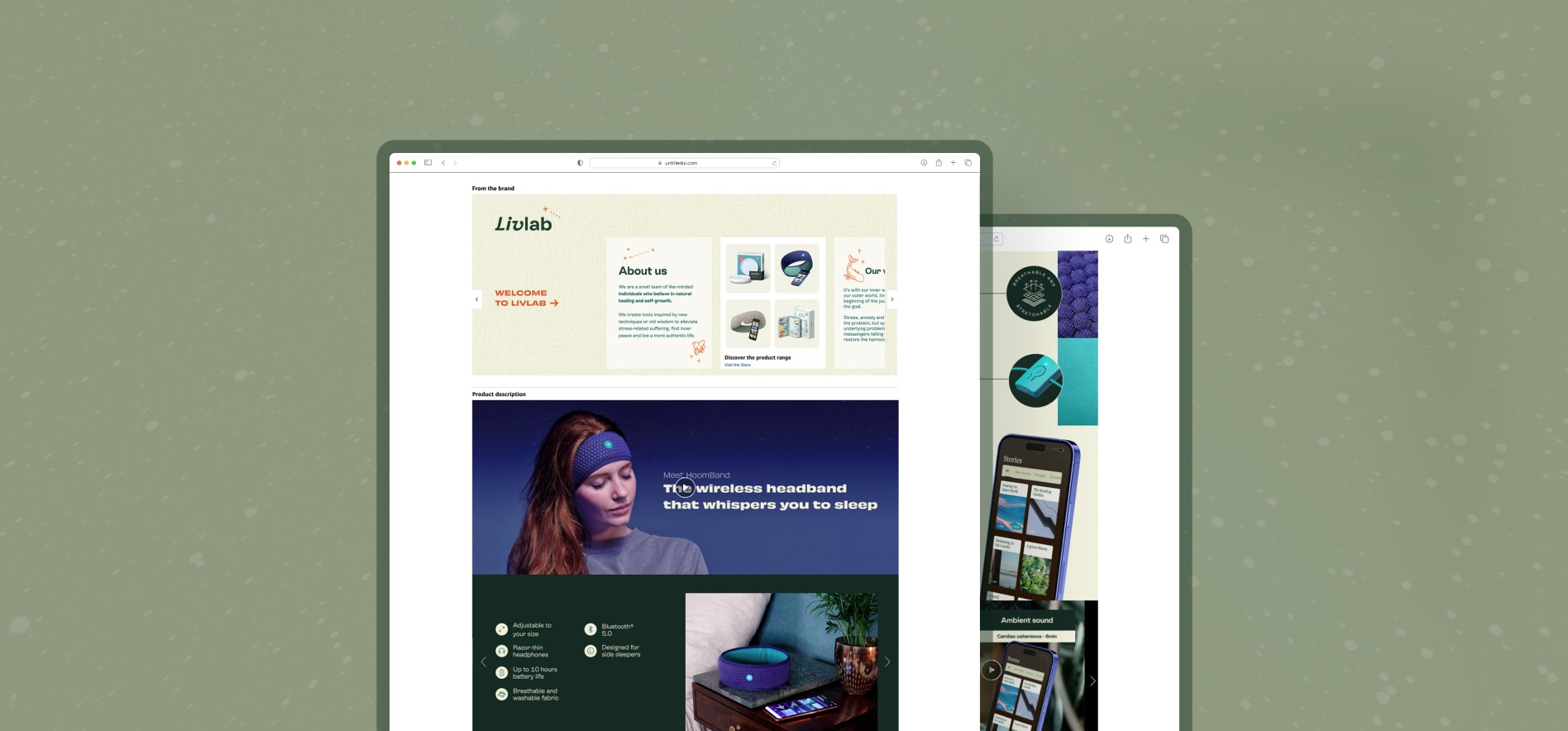
Created a modular A+ content layout covering key product moments: hero, promise, features, how-it-works, reviews, and app integration.
Designed the Brand Story section to introduce Livlab’s mission, product range, and values through a clean, emotional visual system.
Implementation and Testing
Collaborated with the PM to support A/B testing setup and review performance trends.
The selected variant showed improved engagement and conversion compared to the initial version.
Outcome
Delivered a structured and visually consistent Amazon product page for HoomBand, improving clarity across key product sections.
The new A+ layout established a clearer hierarchy and stronger brand presence within Amazon’s constraints, supporting better product understanding and conversion.
Learnings
This project reinforced the importance of structure and hierarchy when designing for performance-driven platforms like Amazon.
I learned how to adapt brand storytelling to strict platform constraints, balancing emotional design with clarity, scannability, and conversion-focused layouts.


